The late-’90s launch of Valve Software’s debut title, Half-Life, coincided with another event that would have a long-lasting and radical impact on the evolution of the company: the emergence and proliferation of the World Wide Web. As we all know, Valve is now very much an online company—arguably even more so than a games company—thanks to the growth of their distribution service Steam, but there’s surprisingly little on the evolution of Half-Life’s web presence.
With that in mind, and thanks to the magic that is the Wayback Machine, here is a list of every single instance of an official Half-Life website we could find, for a fun little bit of Valve history as well as a nostalgic look at late-’90s, early-’00s web design. You’ll find links to the respective archived page by clicking on each image.
A quick disclaimer: we’ll only be focusing on the web page/sites for official Valve-created Half-Life games (so, no Gearbox expansions), although not necessarily Valve-created sites. That’s partly to have a clear focus, and partly because the old Opposing Force/Blue Shift pages seem to be long gone. Also, if we missed anything, be sure to let us know in the comments below!
We’re also not gonna focus too much on any web design technicalities, especially considering most of these are ancient by today’s standards, although any design points worthy of note are certainly going to be mentioned—for instance, the fact that none of these websites really fell into the Macromedia Flash fad, meaning all of them have been surprisingly well-preserved. Thank God for the durability of good ol’ HTML and CSS!
With that out of the way, let’s get started.
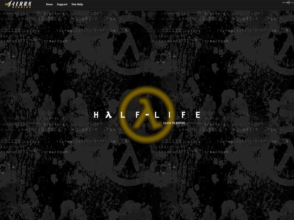
Sierra Studios’ Half-Life website (www.sierrastudios.com/games/half-life/)
Late 1998 – Late 2001
Preceding the first official Valve Half-Life website by a somewhat surprising amount of time, it was Sierra Studios, the distributor, that created the very first official Half-Life website—or, at least, web pages, although it was very much its own small website under the Sierra domain.
Typical of this era of early web design, the site has a simple “Welcome” page with a simple GIF animation of the Half-Life logo in front of a repeated background, which is ripped straight out of the original, pre-Steam Half-Life menu.
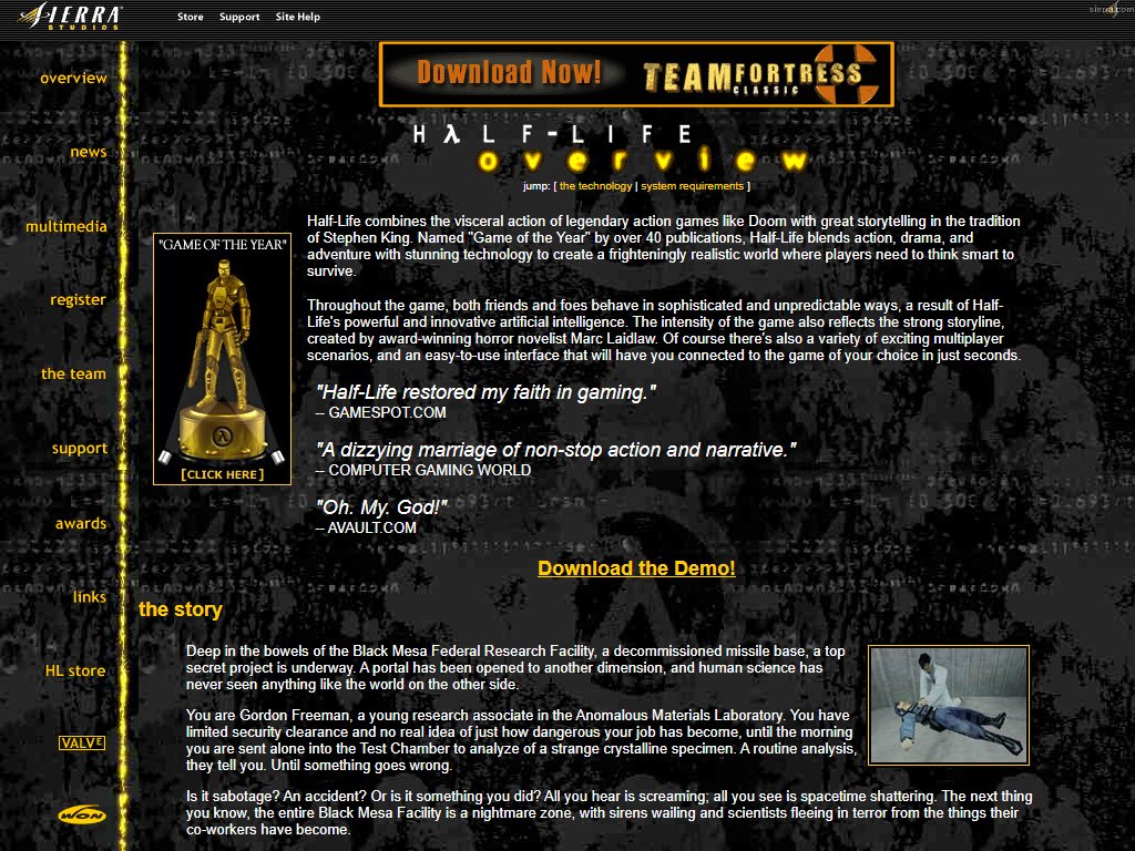
Opening the actual website itself, you’re thrown straight into a detailed overview of the game, focusing on everything from the inspirations behind the game (“the visceral action of legendary action games like Doom [and] great storytelling in the tradition of Stephen King“) to a few humorous-in-hindsight hyperbolic quotes about the game (faith in gaming restored!), a frankly excellent summary and details on the then-groundbreaking tech powering the game. It’s also got a link to download Valve’s subsequent release, Team Fortress Classic.
The site is content-rich in that deliciously late-’90s way that, frankly, is a bit lacking nowadays, with a lot of update activity in the news section, a multimedia section with glorious “full size” 300 by 400 pixel images, mostly beta or Deathmatch screenshots, and long-lost links to game clips and Half-Life: Uplink, a mailing list, a support section and even links to community-created Half-Life websites.
More interestingly of those sections is perhaps the team section, which has an overview of every single member of the team—which would become, and still is, a staple of Valve’s website—and the ironic statement that Valve’s next game will be Team Fortress 2. The best and funniest detail is probably the “phat experience” section at the very end, which details the OG Valve team’s considerable game development experience in titles such as *checks notes* Microsoft Word and Microsoft Excel.
The site lasted for about three years relatively unchanged, with the only noticeable updates being the announcements on the news page, until being summarily taken down in December of 2001, with the URL then redirecting to Sierra’s home page.
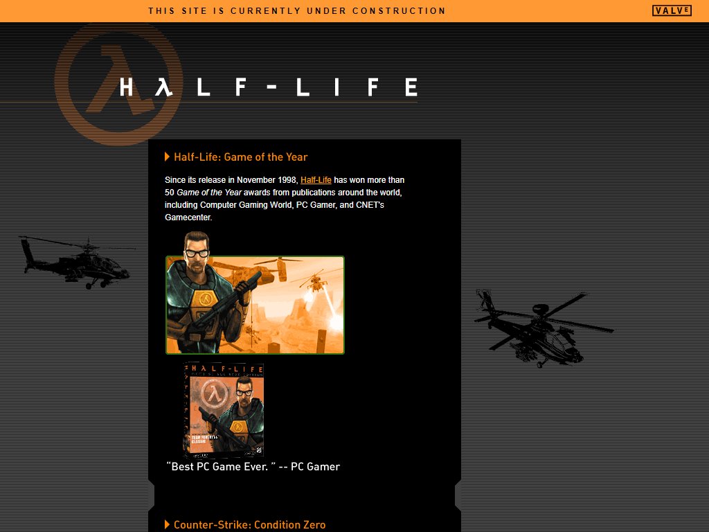
Valve’s first official Half-Life website (www.half-life.com)
March 2002 – April 2004
Fashionably late as ever, Valve finally decided to get its own hands dirty and create an official Half-Life website of their own in early 2002, just over three years after the game actually launched.
Fun bit of trivia: the domain “half-life.com” was first used by a company called “Half Life Organics” and later became a (presumably unofficial) early e-commerce website for Half-Life games and guides, until finally being scooped up by Valve itself.
The actual Valve-created website, initially with an “Under Construction” banner that would be removed sometime before August of 2002, is almost depressingly barren compared to Sierra’s earlier effort, with only a short section on Half-Life: Game of the Year and another on the much-maligned Counter-Strike stand-alone, Counter-Strike: Condition Zero. Not much to write home about, honestly.
Things would definitely pick up, however, as a certain sequel approached…
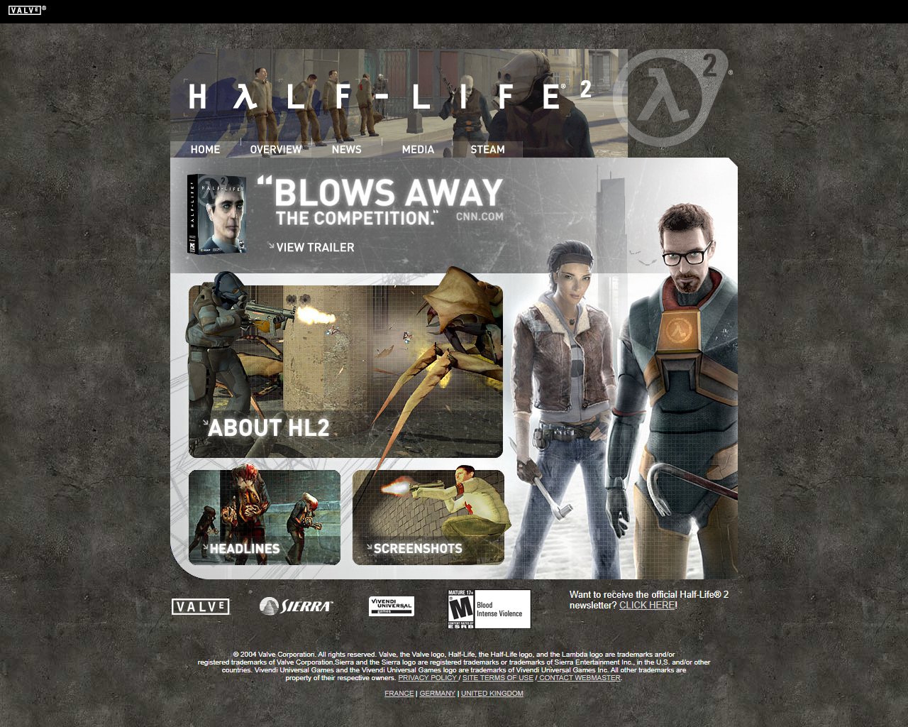
Valve’s official Half-Life 2 website (www.half-life.com / www.half-life2.com)
First version: May 2004 – December 2004
Now, this is more like it. After Valve’s underwhelming effort on their late-stage Half-Life 1 website, the company pulled out all the stops for the official site of their much-hyped sequel, Half-Life 2.
It’s worth noting the date at which this website launched. Half-Life 2 was by then already controversial due to its constant delays after it missed its original September 30, 2003 release date, not to mention the subsequent theft of the Half-Life 2 source code (the infamous “beta leak”) in October. By March 2004, however, the game was finally ahead enough in development to be fully playable, by which point, presumably, the team was finally fully comfortable in doing some more marketing for the game, hence the May 2004 website. It’s also worth noting that the E3 period was in full swing by then, with the site being launched only a week away from E3 2004.
While it is very much a product of its time, the Half-Life 2 pre-launch website holds up considerably well after over sixteen years, thanks in large part to the Swiss design style aesthetic of Half-Life 2, which is still very much in use in web design. Perhaps somewhat unsurprisingly given the aforementioned timing, a lot of the website refers to beta Half-Life 2 assets, with plenty of screenshots on the home page as well as other pages that are fairly different compared to the final game.
Beyond the home page, the site is divided into an overview page, a news page and a media page chock-full of beta screenshots and concept art, much of which doesn’t reflect in the slightest the actual final product, and a download link for the now-legendary Half-Life 2 Windows Media Player skin.
Perhaps more noteworthy is the link to Steam’s first official website. At this point, Steam’s future conquest of the game industry’s digital distribution was little more than a glint in Gabe Newell’s eye, but it was already being marketed and pushed alongside Valve’s (and arguably 2004’s) biggest video game release. There is, however, no reference yet to Steam’s mandatory validation of boxed purchases, which would become another controversy by the time of Half-Life 2’s release.
Overall, the first version of the Half-Life 2 website is a classic and an extremely nostalgic reminder for those of us old enough to recall the hype surrounding Half-Life 2, then the pinnacle of games technology. The site itself would last a considerably long time, albeit (and unlike the Valve of the ’10s we might be more familiar with now) with recurring updates to the content and design, at least of its home page.
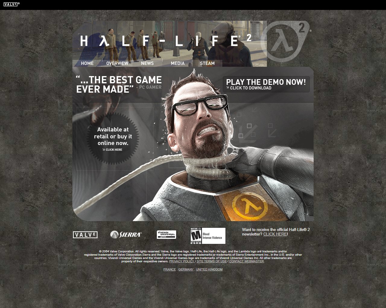
Second version: January 2005 – Mid-April 2006
A few months after release, the site home page got a facelift, with a quote by PC Gamer, a link to the game’s demo and, interestingly enough, a link to the game’s Steam purchase page, in a time where buying games digitally was the exception and not the rule. Steam was already taking its first steps in its eventual dominance. Otherwise, not much else of note with this update.

Third version: Mid-April 2006 – July 2007
The eventual final update of this classic site, which would last well into 2007 until being replaced with another site (we’ll get to that), was quite similar to its former version (and, funnily enough, still proudly displaying a beta image in its header), albeit with different artwork and, more notably, a link to Half-Life 2’s expansion-slash-sequel’s new website.
Speaking of which…

Half-Life 2: Episode One’s website (ep1.half-life2.com)
First version: April 2006 – June 2006
Episode One’s website is another favorite for good reason, sticking fairly close with the Half-Life 2 site’s design aesthetic, again with an overview section, a media page and a news archive, plus a page with pre-purchase info, but that’s not all.
Of course, we can’t talk about the Episode One website without mentioning its story page.
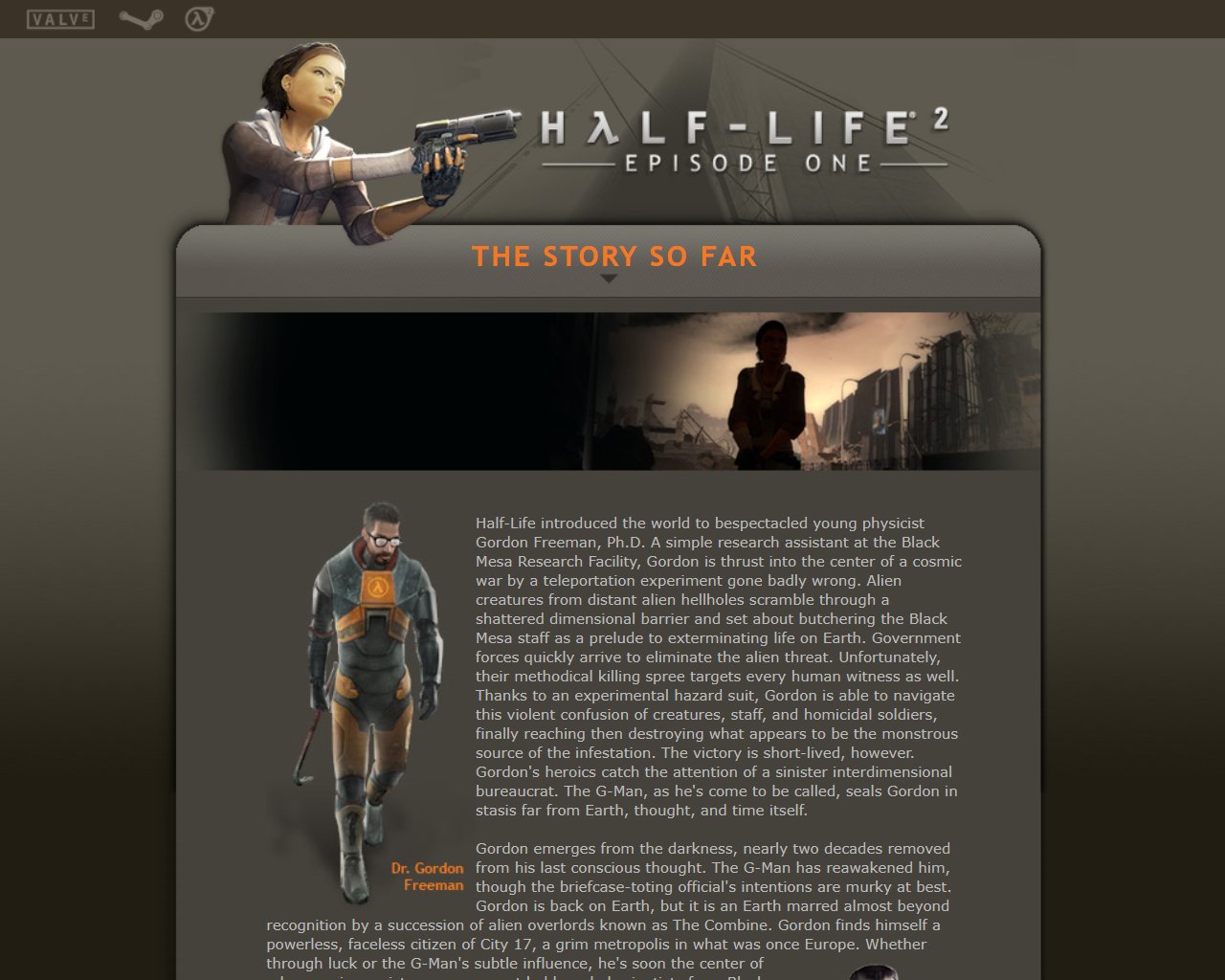
Episode One’s stellar story page cemented—some might argue retconned—many of the overarching details of the series we now take for granted, such as the two-decade gap between Half-Life 1 and 2, previously believed to be ten years. It also gives a couple of vague and subtle hints of the G-Man’s intentions and shows what a pity it is that Marc Laidlaw never wrote any anciliary Half-Life prose.
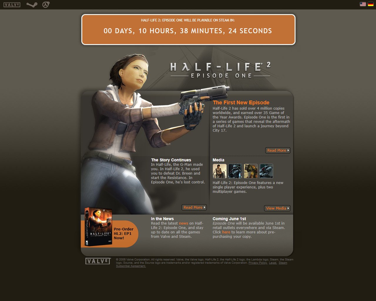
Second version: June 1, 2006
This time, Valve actually stuck to its word and the official site reflected that, with a neat little timer showing how long until the game unlocked on Steam.
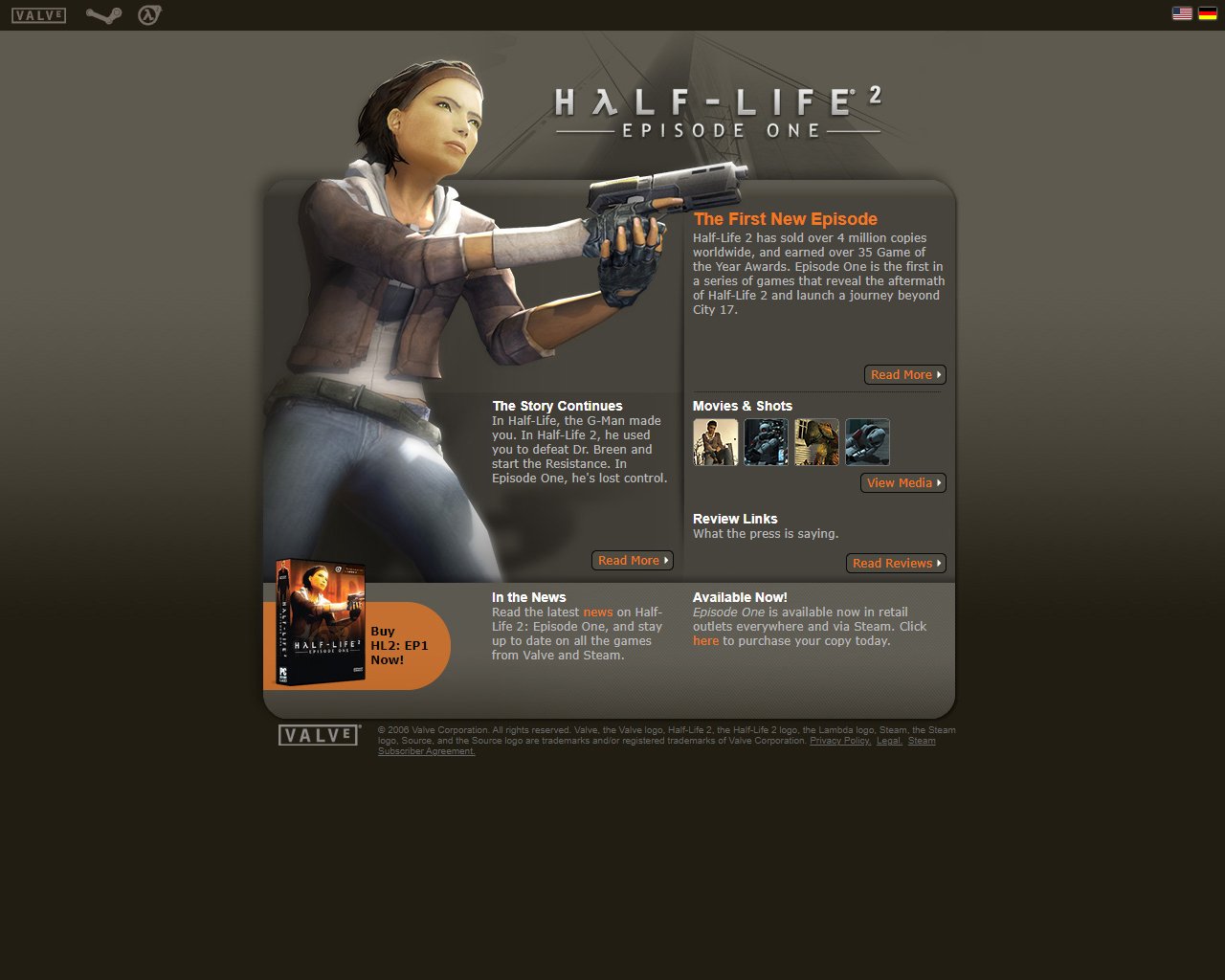
Third version: June 2006 – July 2007
Unlike the sweeping home page changes of the Half-Life 2 website, not much changed with Episode One’s post-release, with just a new link to all the praise the game garnered (Gamespot’s in particular seems a bit heady in hindsight) and the indication that, hey, the game’s available now.
This version of the Episode One site would last for about a year until both it and Half-Life 2’s were replaced by…
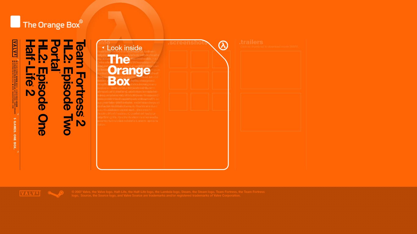
The Orange Box website (orange.half-life2.com)
First version: August 2007 – September 2007
Oh, boy. Where to begin with this one.
To start, it has to be said, the design on its own is actually quite nice. Perhaps not the most modern by today’s standards, but it’s striking and the hover animations are nice.
Of course, this isn’t really a Half-Life website, per se. The Orange Box was a bundle of the entire Half-Life 2 series up to that point with two extra surprises, the long-awaited Team Fortress 2 (remember that promise on Sierra’s website?) and a little experimental puzzle game by the name of Portal, no idea how that ended up. The entire value proposition (5 games in 1 box) now seems downright mean considering what the ’10s would end up like.
That said, not only did it bear the Half-Life 2 domain, it took over the Half-Life domains, replacing both the old HL2 site and Episode One’s. It’s also the Half-Life website we’d be stuck with for over twelve years, but I’m getting ahead of myself.
Each game in this compendium has its own small page bearing the same design, with Half-Life 2’s and Episode One’s recycling text from their respective defunct websites, although Half-Life 2 has more screenshots from the final game while still keeping a couple beta images.
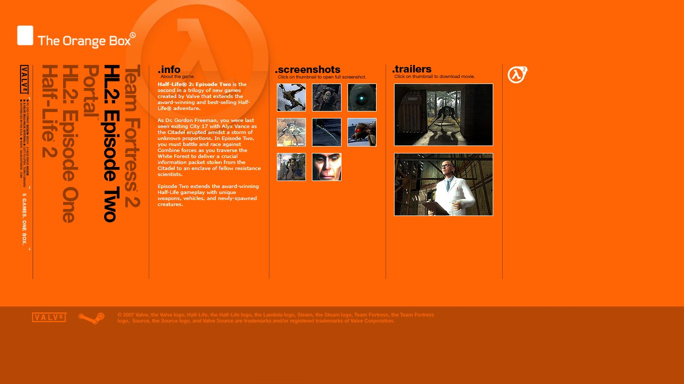
As a result of this move, Episode Two fares the worst out of all the Valve-produced Half-Life games in terms of web representation, and about as bad as Valve’s first official site for the original Half-Life (which, as we saw, still got its own full website thanks to Sierra). Besides screenshots and two trailers, it’s just three short paragraphs describing the basic plot and pretty much implying the game is just more of the same (which… well, it is, but maybe the marketing shouldn’t be so blunt about it). Even Team Fortress 2 and Portal, the unproven underdog of the package, both got an extra paragraph compared to Episode Two.
Overall, while the design is not terrible for the standards of the era, it’s a pretty underwhelming and frankly somewhat empty site, lacking many of the features seen in previous sites. Plus, given that the Orange Box is now essentially just a bundle on Steam and all the games stand separately, it’s also more of a curiosity and a reminder of Valve’s somewhat odd marketing choices in this era.
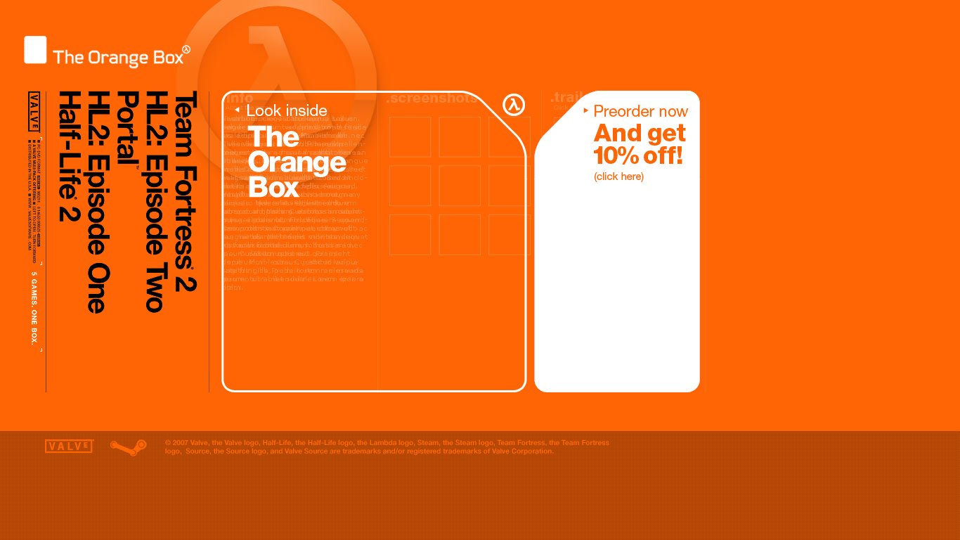
Second version: A few days during October 2007
The first, relatively minor change to the Orange Box website—and yet, still the most major revision it would see, as you’ll soon find out—was the addition of a block linking to the Box’s Steam page. Interestingly enough, there is no mention of retail stores anywhere; by this time, Steam is in full swing and Valve makes no qualms about it being the place to get The Orange Box. While that would be a given now, it’s worth noting that this is just one year after Episode One’s website consistently mentioned retail outlets alongside Steam.

Third version: A few more days during October 2007
The lack of retail mentions wouldn’t last, though, as the very first post-launch iteration of the same website now proudly declares that the Orange Box is “Available at Stores Now!” The link, however, is still for Steam, with the slightly cheeky mention that, if you have Steam, you can get it now. Why wait?
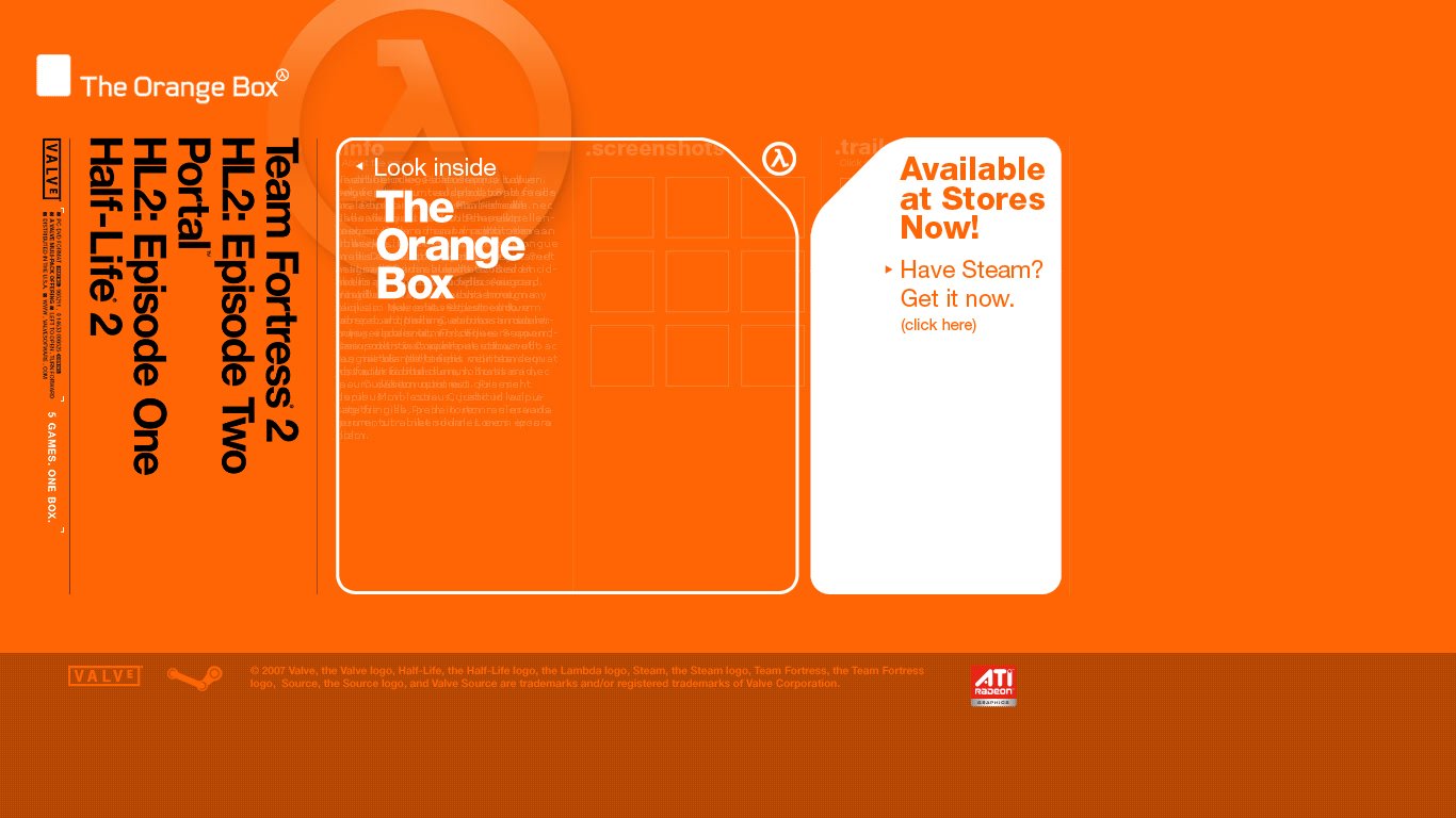
Fourth version: Late October 2007 – Mid-January 2008
Now, this is where things get slightly more interesting, in a very minor and irrelevant sort of way.
At first glance, you may not notice anything different about this revision compared to the last one, but direct your gaze towards the site’s footer section and you may just make out a new addition to the site: a small banner for ATI Radeon graphics.
ATI and Valve had, by this point, an established relationship, with ATI having offered coupons for Half-Life 2 with select graphics card in 2003, Steam copies of Half-Life 2, Episode One and, in some cases, even the rest of the Orange Box in 2007 and, most infamously, having organized Half-Life 2’s launch party in Alcatraz back in… 2003, a release date that, as aforementioned, Valve missed altogether. Whoops.
Therefore, ATI getting a little mention in the Orange Box’s website is probably not such a big twist, but it’s what would come later that makes this detail interesting.
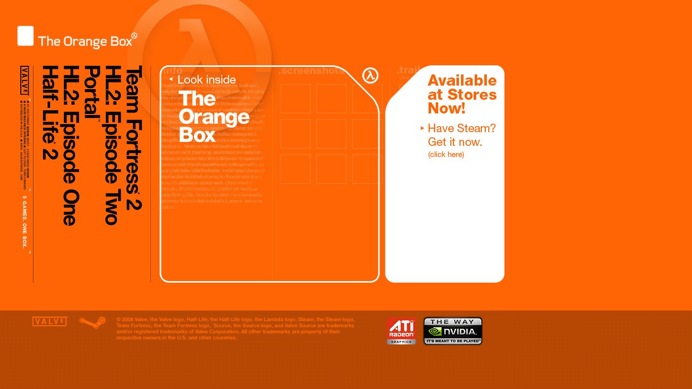
Fifth version: Mid-January 2008 – February 2008
Just a few months after ATI got its logo on the Orange Box website, something curious happens: NVIDIA joins the party.
Yes, the footer gets a little update as NVIDIA, seemingly refusing to be outshined by the competition, gets their logo next to ATI’s, which also gets a slight increase in size to accommodate.
So, basically, Valve seems to have made some sort of deal to highlight ATI Radeon on the Orange Box’s website, only to NVIDIA to later cut a deal of its own, rendering the logos humorously redundant—seeing as they are basically the duopoly of graphics cards, especially at the time. Yes, it’s true, Source games run on any graphics card, gasp!

Sixth version: March 2008 – Mid-May 2008
The site soon gets another iteration as a “Winner of Over 100 Awards” badge is placed on the home page, linking to a pop-up page with a list of awards, both Game of the Year and craft achievements.
Valve wisely resists the temptation of adding Half-Life 2 and Episode One’s own accolades to the list, seeing as they technically belong to the same package now, and also does the honest thing of distinguishing between awards for the Orange Box as a bundle and its new games.
Not terribly surprising now thanks to the benefit of hindsight, Portal, which at first was basically the “extra” of the bundle, gets the majority of praise, with the new Half-Life 2 episode itself unfortunately getting the least, the same “more of the same” syndrome the website itself seemed to vouch for. Just more for the pile of shame of what is technically still a Half-Life 2 website—the domain, after all, is still “half-life2.com”.
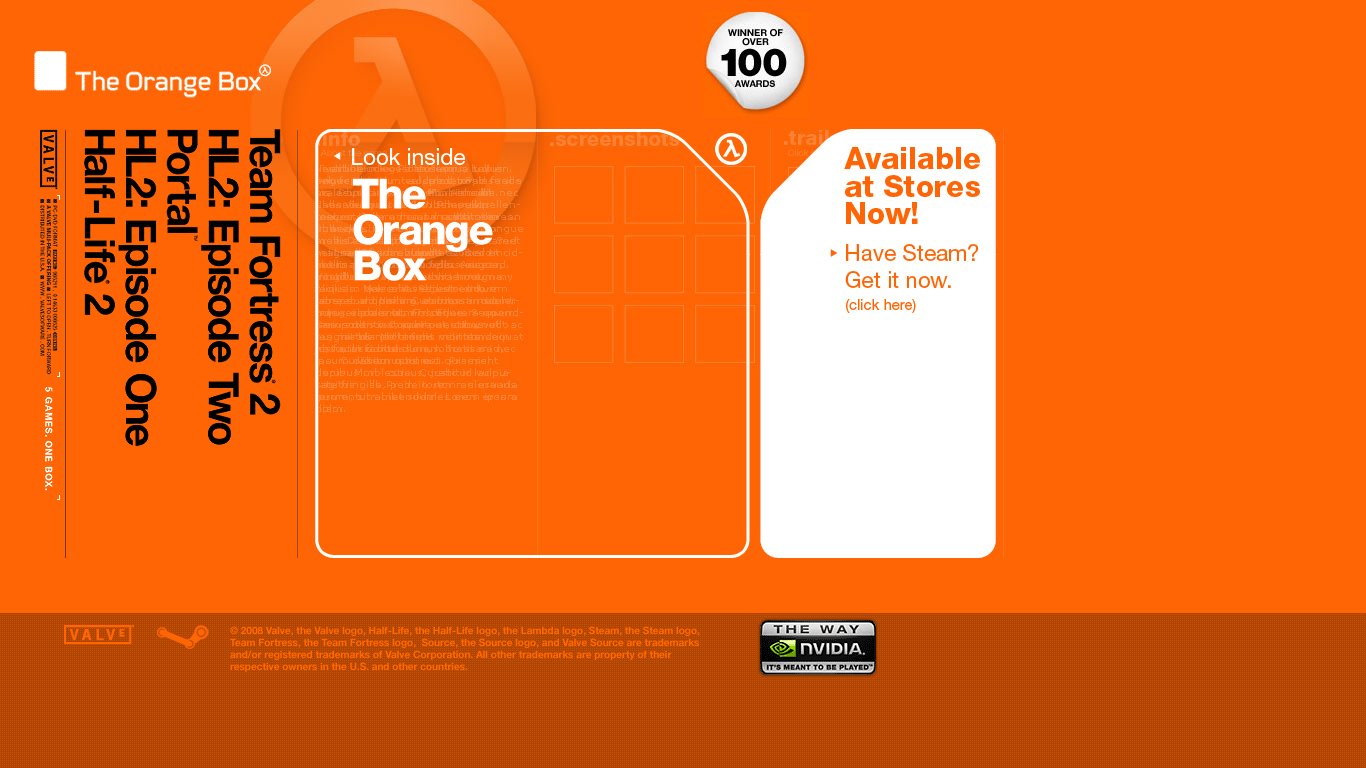
Seventh version: Mid-May 2008 – January 2009
Another twist on our little graphics card company family drama, as ATI Radeon is the first to fall off the footer, leaving NVIDIA as the proud proclaimer of being the way the Orange Box is meant to be played. Presumably, ATI found out Valve was cheating on it with its rival—or, more likely, whatever non-exclusive deal ATI made to be represented on the site expired after a few months.

Eighth version: Late January 2009 – October 8, 2010
Another visually minor but nonetheless curious and amusing update to the website, once again in its very busy footer section.
Namely, the copyright disclaimer at the bottom gets a big chunk of text appended to it, regarding the Orange Box’s lack of affiliation to France Telecom, which, as you may guess from the title, is—or rather, was—a France-based multinational telecommunication company.
The short story, not to get too much into an aside, is that France Telecom owned the trademark to the name “Orange” presumably since its acquisition of Orange plc in 2000 and apparently took offense at Valve branding their product as the Orange Box, or perhaps saw grounds for a profitable lawsuit. Alternatively, perhaps Valve’s legal team preventively realized they could get in hot water due to the name and added said disclaimer, although, given the wording, the best bet is probably the former theory.
Either way, this is all massively irrelevant in the history of Half-Life sites, but it’s enough of a curio and a seemingly-unmentioned factoid of Valve history that we just had to highlight it. Who knew the Orange Box website had so much to teach us, huh?

Ninth version: October 9, 2010 – May 2020
At long last, after a few twists and turns, here we are: the final major iteration of the Orange Box website.
The only noticeable change is really the final removal of the NVIDIA logo from the footer, after almost three years and, amusingly given Valve’s previous relationship with them and their importance to Half-Life 2’s launch itself, far outlasting ATI Radeon. It’s probably worth pointing out that NVIDIA would later release a portable version of Half-Life 2 and its episodes for its short-lived NVIDIA Shield handheld, so clearly the two companies have a good standing.
Of course, seeing as Episode Three would never materialize, this last iteration of the Orange Box website would survive for nearly a staggering ten years, with the Episode Two page in particular proudly proclaiming it all along as the second in a trilogy that would ultimately never conclude.
This website, long outdated and unprepared for the smartphone revolution that had long come, would finally be put out of its misery in May 2020, with the domain now redirecting to the Orange Box’s current Steam page.
With the surprise announcement of Half-Life: Alyx, the time would finally come, after thirteen grueling years, for a new Half-Life website.
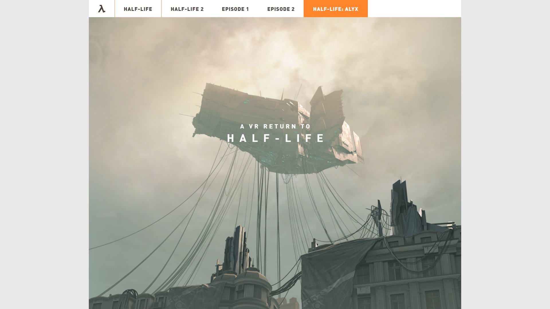
The Half-Life: Alyx (and Half-Life series) website (half-life.com)
November 2019 – Present
While there is certainly some modern web design bias at play when we proclaim this, it still has to be said: this website is perfect.
The new site, developed internally by former Campo Santo developer Chris Remo, naturally focuses on Half-Life: Alyx, the new game in the series and the one Valve’s marketing would want to push at this period of time—and, interestingly enough, the domain redirects immediately to the Alyx page, despite there being a distinct series home page. However, it also showcases the proud, storied history of the franchise by including individual pages for each Valve-created game in the series. There is also a sub-page for VR, which, well, of course there is.
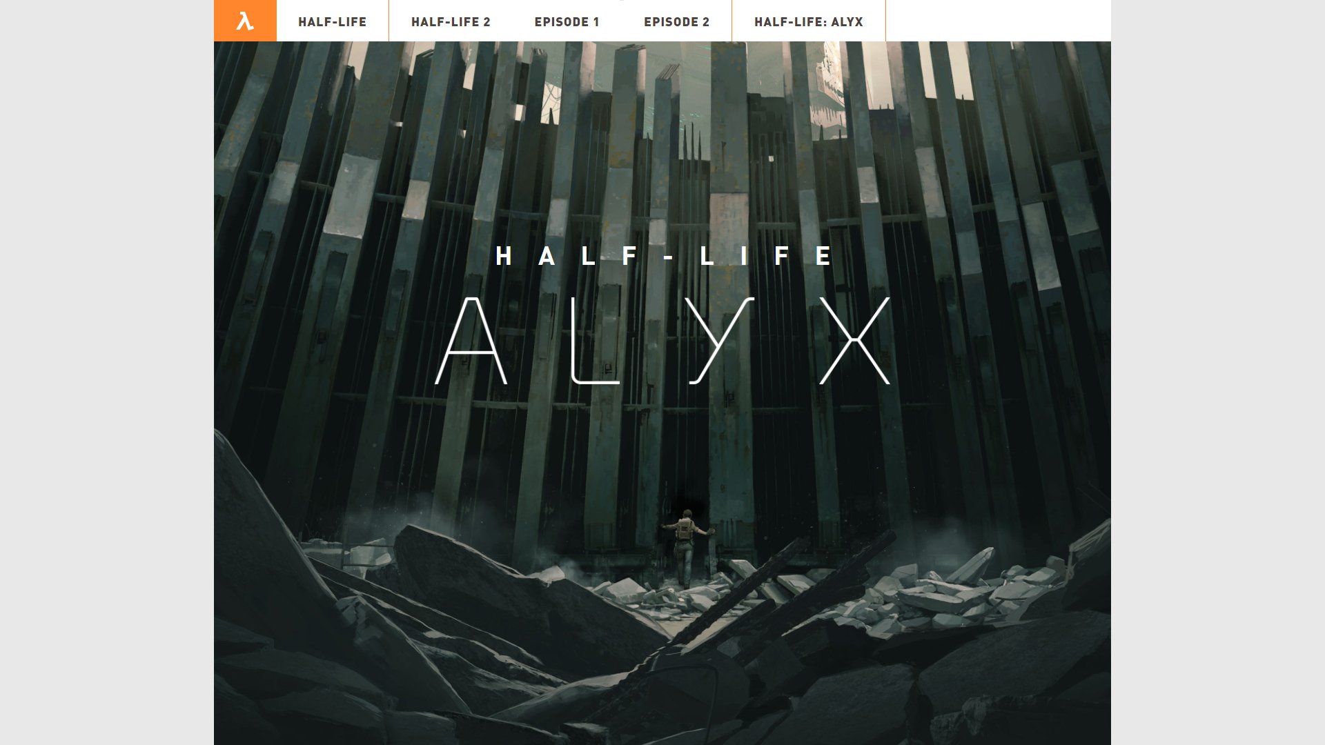
It’s worth noting that, being the first official Half-Life website developed from scratch after 2010, it’s also the first one to actually be mobile-friendly, i.e. responsive to mobile devices, so you get an equally great experience whether you’re viewing it through your desktop browser or on a mobile device.
And what a site this is! The Alyx page has some stunning (and custom-built!) parallax effects that really reflect, for the first time, the awesome atmosphere of the games themselves (and, arguably, the immersion of VR itself). By comparison, the other pages are relatively simpler and more static, but there is still just a level of polish to everything that makes the whole experience very pleasant, not to mention a return to form for Half-Life series’ stature as one of the videogame greats. It also doesn’t fall prey to blindly following the latest web design trends, which would make it age far too quickly, although it’s certainly inspired by some best practices.
As for the pages for the rest of the series, it’s worth noting that, while they may not share that same dynamic animation as Alyx’s, there clearly was more care put into them compared to the Orange Box’s website, as each page has completely new text describing the games and their accolades, rather than once again reusing the old content from their respective (and long-defunct) websites.
It’s worth noting that the site has already had a few revisions, namely the addition of Alyx’s gameplay clips, a soundtrack page and, funnily enough, the correction of a screenshot that had a visible “ERROR” model. That being said, for the purposes of this article, we’re not going to go too much into the differences—The Orange Box was probably enough for a lifetime in that regard, and they felt less like revisions and more like a carefully-planned series of content drops.
Overall, the current Half-Life website is truly a celebration of, as the home page puts it, “two decades of raising the bar”, not just of the latest entry in the franchise—although it certainly gets its due, as well. It harkens back to some of the classic Half-Life sites of the past, but with a modern and refreshingly forward-thinking vision of the series. We can only hope that whatever comes next, when (not if) a new Half-Life game comes out, follows this upward trend.
We hope you enjoyed this comprehensive look at the history of Half-Life websites over the past decades! Leave a comment below on which one is your favorite and why. Also, if we missed anything, please let us know so we can make this article even more complete. Of course, it’ll also be updated whenever a big new revision finally comes out… which will hopefully be sooner rather than later.
As a huge fan of the franchise, I never bothered to visit these websites. Hell, I didn’t even know they existed! You really taught me something new with this article. Well done!
I’m still having a nostalgia attack when i enter to The Orange Box website, it may not be the “Best Website” but the impact of seeing those new games, specially the Teaser Trailer of Portal, OOF! i wouldn’t trade it. it teleports me to a different time when Software and Web Navigation was different, more freely and chaotic compare to the barren wasteland dominated by Facebook’s Iron Fist and Mobile Devices.